

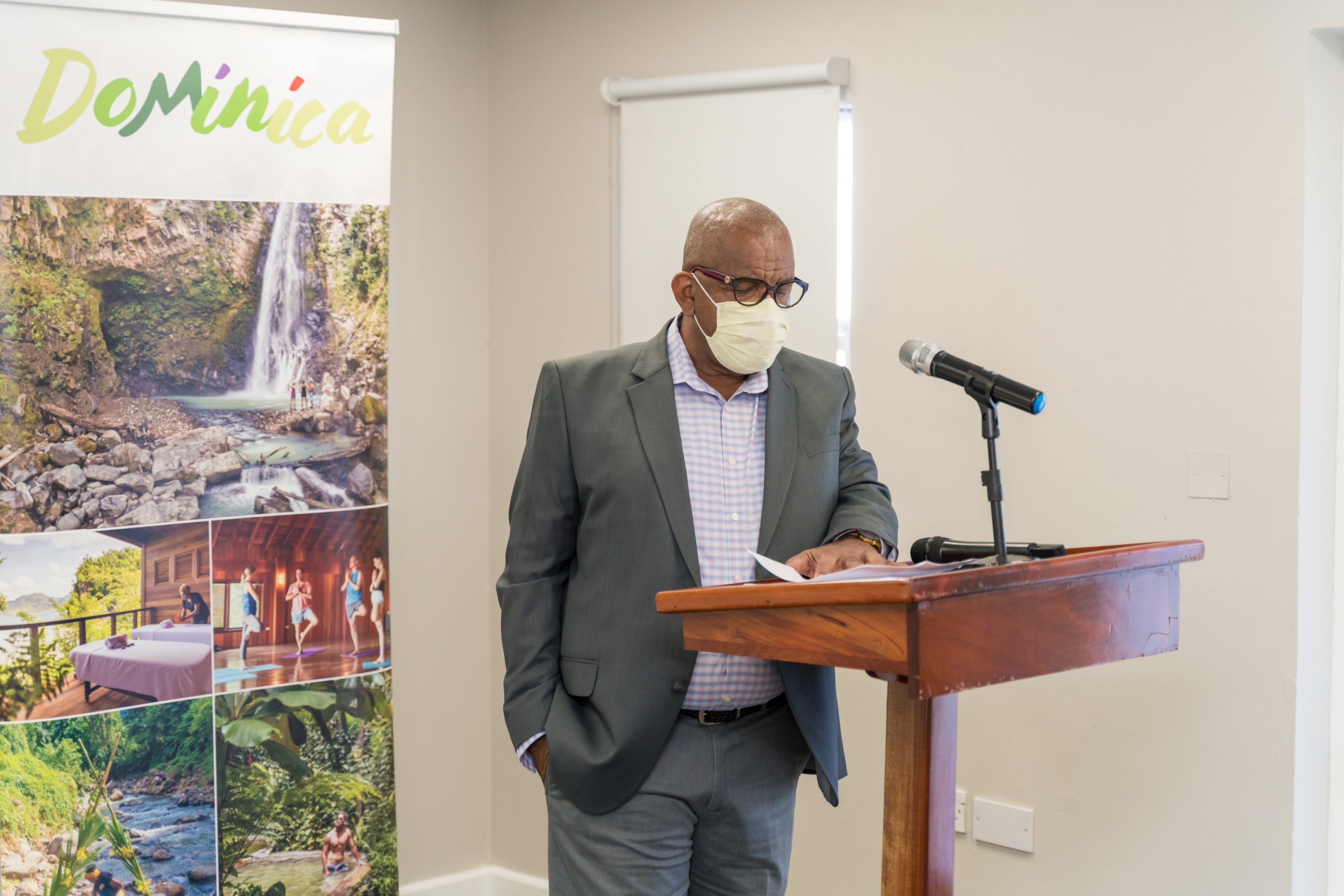
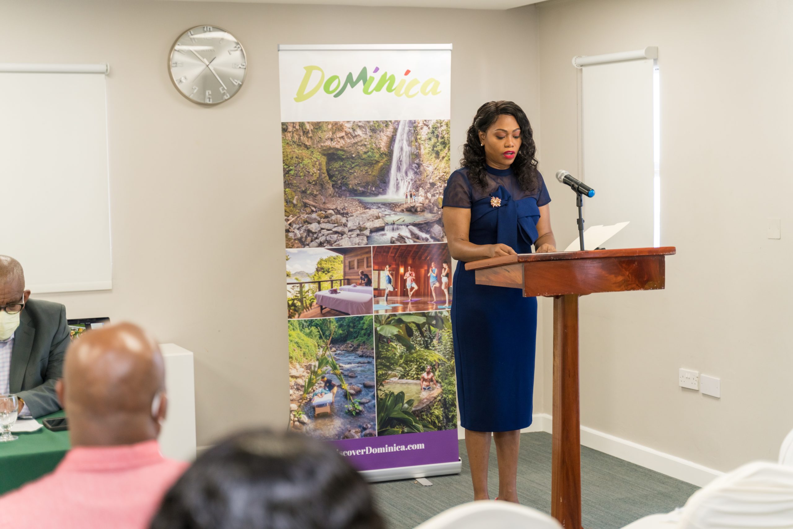
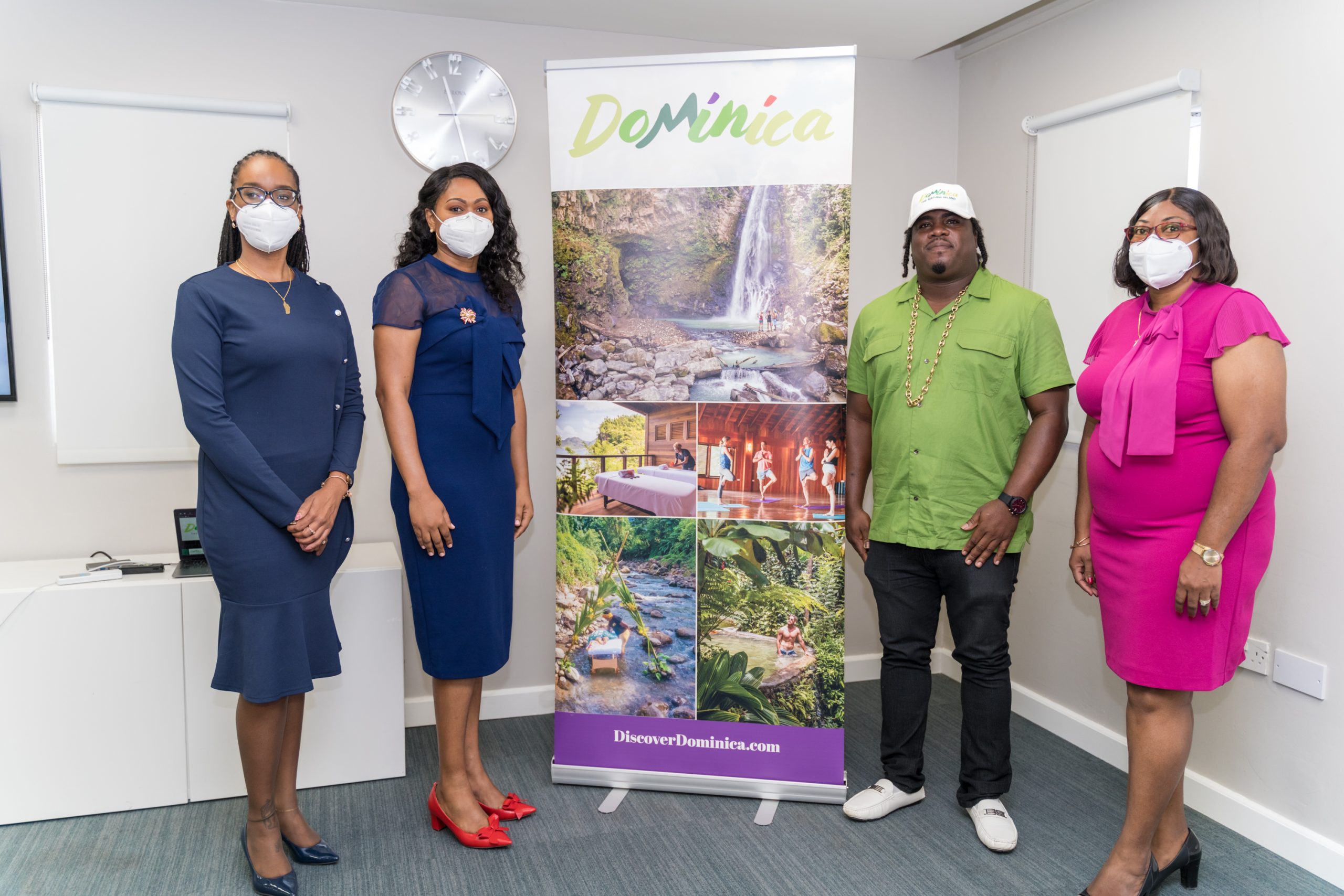
The Ministry of Tourism, International Transport & Maritime Initiatives, and the Discover Dominica Authority are proud to announce the launch of the new destination logo as part of the ongoing evolution of the Dominica brand. We are indeed excited to share this new logo which should better clarify the value proposition of Dominica.
As early as 2016, the Discover Dominica Authority began working towards establishing a bolder identity for the Commonwealth of Dominica. Dominica is frequently confused with the Dominican Republic. It is necessary to emphasize and distinguish the two countries because they are significantly distinct. A global study revealed that changing the logo will help Dominica stand out in a crowded market for travelers interested in what the island has to offer.
The previous logo had been used for many years and was difficult to discern. Similarly, it loses resolution in smaller applications like digital advertising and social media. Considering people are increasingly using smaller mobile devices, the logo must be easy to see. Dominica’s tourism has expanded and evolved over the years, and it was agreed that a new logo would better reflect who we are as a Caribbean destination.
The new logo design swaps the previous complicated-looking structure with a more minimal look. This re-branding approach brings the design more in line with the island’s aesthetics and portrays flexibility.
Opinions of key stakeholders were sought including global source market representatives, prospective visitors, hoteliers, business owners, and members of the Government. Dominica’s sweet spots were agreed upon. Dominica is natural, wild, dignified, lively, luxurious, serene, life-changing and ultimately “Where Nature Meets Nurture”.
As unique as the island itself, the letters have the feel of the rising Morne Trois Pitons and the various shades of green depict the lush and verdant landscape covering the country. The rich purple accent color comes from our beloved Sisserou Parrot and the vibrant red connotes our creole culture. With a very strategic approach, we were able to retain “The Nature Island” tagline. There is a great deal of equity in this tagline as it helps to create a clear picture and reinforce our position in a competitive market.
In the upcoming weeks, several aspects of the logo rollout will be promoted to include new website branding, logo email signature, letterhead and business cards, promotional items, tradeshow assets, and other collateral as needed.
This transformation will imply everywhere in our marketing and promotion strategy to the use by end-users. With this, we aim to present Dominica better and to attract more visitors to experience the beautiful Nature Island. Tourism is essential to Dominica’s economy. Therefore, we need to increase awareness of and interest in Dominica’s unique natural, wellness, and adventure attributes, both regionally and internationally.


